A PERSONAL TOUR OF THE BOOK
This is a guided tour of the book design and illustrations for David Delamare’s Alice’s Adventures in Wonderland. (In a few weeks, I’ll add a tour of the text.) Feel free to send additional questions to me (Wendy) at delamare@teleport.com.
If you have a copy of the book, please take it out and follow along. We shall heed the King’s suggestion to “begin at the beginning…and go on till you come to the end: then stop.”
The Fragile Label:
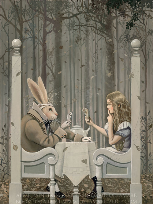
You may find other representations of the Hare on pages 60 and 68 (pencil drawings) and at pages 62, 67, and 70 (oil paintings). Below is a colored drawing (at left) and a painting (at right).
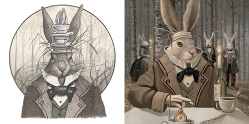
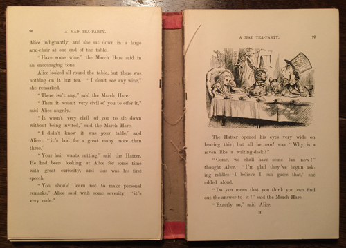
“Mad as a March Hare” is an English expression that extends much further back than Lewis Carroll and refers to the wild antics of European hares during their breeding season. Carroll’s illustrator, Sir John Tenniel depicted the Hare with straw on his head (apparently a common way of suggesting madness). David kept the straw and sometimes added dishes. I can’t help noticing that the fork on the table is pretty misshapen. That makes sense because rabbits (and probably hares) chew on absolutely everything.
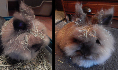
Two real rabbits had the run of David’s studio (and still do). They, too, always seem to be covered in vegetable matter and are prone to wild antics and mischief. This is Rupert Quincy, who decided to roll in hay immediately after I vacuumed. (To view more photos of Rupert, visit his fan page on Facebook.)
To see the seemingly mad behavior a rabbit can display when happy, search Youtube.com by “rabbit binky.” Rabbits also display very dramatic yawns that we have often attempted (unsuccessfully) to photograph. David was delighted that the March Hare yawns on page 68, so he had an excuse to illustrate this phenomenon.
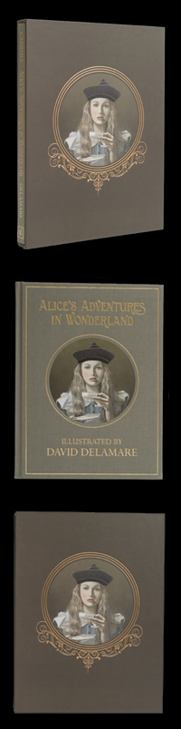
The Book Size:
But arranging art books often poses a challenge. Creative designers frequently choose unusual sizes and formats. Many of the art books in our library don’t fit into ordinary shelves or are too tall or deep to arrange well with others.
I chose the size of this book very deliberately. I wanted it to be tall enough to attractively fill a standard US 12-inch shelf with just enough room at the top to safely remove it from its place. I plan to keep this same size and format for other books in this series so that they will function aesthetically as a set.
Our Alice Model:
When Cameron sent us her snapshots, I was convinced immediately that she was “the one.” David was enthused but slightly less confident, since there are many factors that make an ideal model.
We were both surprised to discover that Cameron was extremely shy— not at all like the models with whom David typically worked. In fact, she was cautious enough to bring her mother along to her first modeling session. That day, she and David had their first “shoot” in the basement while her mother and I sat upstairs and talked. We all laughed when Cameron emerged from the basement and said with visible relief, “I’m glad that wasn’t creepy!”
In retrospect, it seemed miraculous that Cameron answered the ad. We were so grateful that she did. Her shyness and innocence combined with her extreme precocity and a certain other-worldly quality made her perfect for the role.
Though she was “old” (nineteen) for an Alice model, she was so childlike and imaginative that she seemed the perfect age to us. As it turns out, it’s fortunate we didn’t work with someone younger, because the project took several years and it would have been problematic to have a model whose appearance was changing.
Cameron was also a natural actress, which proved extremely helpful, and she was willing to tolerate some unusual requests, including climbing, fully dressed, into our bath tub.
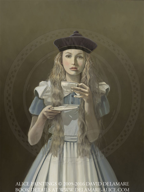
Alice’s Hat:
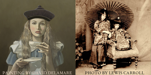
Alice Liddell (above, at right) was the namesake of the story’s central character and also the muse for the tale. I didn’t fully appreciate the power of her presence until I saw Carroll’s original photos of her. (Somehow this had never quite come through in the reproductions I had seen in books.) Much like our Alice model, she had an inexplicable enchanting quality that is deeply inspiring to artists.
The Function of the Slipcase:
Incidentally, the gold gilding on the tops of old books was designed to protect their pages from dust. There is no need to gild this book because the slipcase performs the same function.
Please note that books (especially new ones) do sometimes warp with changes in humidity. Therefore, to preserve your book’s shape, we recommend storing it in its slipcase when it’s not being read.
Never store a book in a damp environment (such as near a window) or leave it in direct sunlight. If your book ever feels tight in its case, turn the open side of the case downward and shake the book out over your hand or a soft surface. Never force a book out of a case by tugging, as this may cause damage.
The Slipcase Image:
My esteemed co-editor, Dr. Selwyn Goodacre, who has over 2000 different editions of Alice in his collection, gave me one such old book. It survived a tremendous amount of use during the editing process and just as I reached the end of the first proofreading round—literally as I was deciding whether to put a period after “The End,” it slipped to the floor and broke. This seemed somehow fitting. The broken book remains a treasured souvenir of this journey.
The Book Color:
I was relieved to learn that Carroll’s suggestion of red was not based upon aesthetic tastes. He wrote, “I have been considering the question of the colour of Alice’s Adventures, and have come to the conclusion that bright red will be the best—not the best, perhaps, artistically, but the most attractive to childish eyes.”
You can imagine my delight when I viewed the most sacred of all Carrollian relics—the manuscript that Carroll gave Alice Liddell, and discovered that it was bound in dark green. (Carroll also favored green for his scrapbook of book reviews.)
I did, in the end, find one way to reference Carroll’s red—I selected a bright red ribbon bookmark. A darker red would have been more handsome, but the brightness provides a little whimsy for “childish eyes” (whether or not they belong to children).
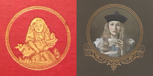
The Cover Image:
You may notice a very subtle difference in rotation between the image on the book cover and the the image on the slipcase—this is a sign that it was hand-applied.
The Debossing:
When David and I first envisioned this book, the one thing we knew with certainty was that we would want a cloth cover, hand-applied or “tipped-on” image, and debossed foil, because these are the features we associated with our favorite antique books.
The Cover Fonts:
Headband & Tailband:
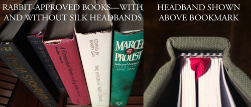
Not all hardbound books have headbands. This is unfortunate, because they’re charming and it’s one of the more pleasant tasks of the book designer to choose them. For this book, I chose a black and white check pattern (above, right) as a reference to Lewis Carroll’s interest in chess. (The entire plot to the Alice sequel Through the Looking Glass and What Alice Found There plays out as moves in a chess game. In fact, there’s a little diagram of the game in the first pages of the sequel.)
The Binding:
Sewing through the center of the folds rather than right next to them (a practice known as “side sewing”) has the added advantage of allowing the book to open more completely. I further specified a “lay-flat” binding, meaning that the binding is sewn a bit looser, allowing the pages to lay completely flat without forcing. This helps to preserve the compositional design of the book and allows images that cross two pages to lose very little visual information to “the gutter.” Feel free to open your book completely flat. This will not damage it at all.
The Printing Method:
If you use a magnifying glass to look at images in most of your art books, you’ll probably notice a clear pattern of different sized dots. If you do the same with your Alice you’ll see much finer, equally-sized dots that appear more randomly placed, giving a more continuous look.
Stochastic screening also uses less ink and offers a wider color gamut. The blessing and curse of the stochastic method is that color doesn’t vary much on press. With traditional printing methods, one can make subtle adjustments during the printing process. But with stochastic printing it’s more critical to have highly accurate proofs before printing.
After selecting a reputable printer that specializes in art books, I also hired a print broker with color expertise (iocolor in Seattle) and worked with them to perfect the proofs. David and I were very impressed with their work.
The Illustrations
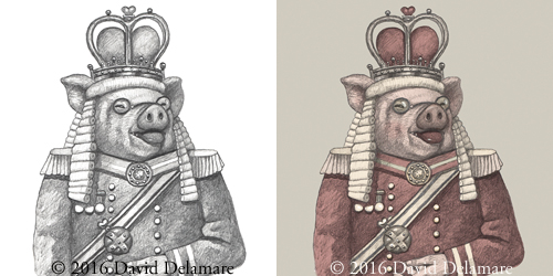
The other images are traditional pencil drawings. When we decided to tint the drawings, David first tried using watercolors, but this resulted in a loss of detail. I suggested we try a digital method and over the course of two and a half years, I finally arrived at the right approach. Below, you can see a drawing at left and the colored version at right.
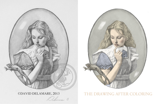
David and I colored all the drawings using Photoshop and a Wacom tablet. In most cases, he chose the colors and finished the images rather roughly. I then cleaned them up, attending to fine details for which he had little patience. I also spent several months in 2016 reworking the drawings to make them lighter, sometimes changing to more pleasing colors.
Fortunately, David and I had very similar visual tastes, so he was comfortable with letting me make changes and was pleased with all of them. In the end, I spent more time on the drawings than he did. The process was so time-consuming that at one point he remarked that it would have been faster simply to produce oil paintings.
The Ornaments:
I then began frequenting used bookstores looking for Victorian books with more ornate interior ornamentation, and I was, frankly, surprised to discover that, like my books, they were very simple.
While Victorian advertisements and product labels contained elaborate typesetting and ornaments, book interiors of the period tended to be fairly straightforward. Nonetheless, I wanted some kind of ornaments as a nod to the feel of the era.
Specifically, I hoped to find something sinuous that suggested ironwork (thus referencing both the plants and fencing in Victorian rose gardens). Also, though it was a tall order, I hoped to find something that incorporated hearts (in honor of the royal court).
I looked at thousands of ornaments before settling upon a set offered by Russian graphic designer Alexander Sidorov. They were precisely what I was seeking and felt to me as though they came from the nineteenth century.
Curious, I contacted Sidorov and was pleased to learn that he had, indeed, adapted them from a set of nineteenth-century German typesetting elements. I adapted them further for my purposes. You’ll see the results on the slipcase, on the half-title page, the title-page, surrounding the table of contents, and around each page number (properly known as a “folio”).
The First Image:
The Dedication:
Mark was a great fan of Lewis Carroll and it was a foregone conclusion that we would dedicate this book to him. Before he died, he saw many of the paintings evolve and was fortunate to receive the original Cheshire-Cat painting from page 126 as a gift from his wife, Elizabeth.
The Frontispiece:
The Golden Afternoon:
This image sets the tone for David’s vision, which was not a literal interpretation of the story, but an expression of an internal “feeling.” This is a potentially interesting topic to discuss with children—the idea of “artistic license” or expressiveness. You might invite them to look for discrepancies between David’s images and the text. The Caterpillar on page 38, for instance, isn’t blue. Meanwhile, the Knave of Hearts on page 108 clearly isn’t made “entirely of cardboard.” David also incorporated moons in many of the paintings but one might well discuss whether the moon would be visible “underground” and, if not, what light sources would be.
Animal Characters:
David painted anthropomorphized animals his entire adult life and always found them to be an excellent device for conveying human personality and idiosyncrasies. He enjoyed this quotation from Wittgenstein:
“The older I grow, the more I realize how terribly difficult it is for people to understand each other, and I think that what misleads one is the fact that they all look so much like each other. If some people looked like elephants and others like cats, or fish, one wouldn't expect them to understand each other and things would look much more like what they really are.”
I suspect that Carroll would have liked this statement. In fact, it always reminds me of Humpty Dumpty’s complaint in Through the Looking-Glass and What Alice Found There:
“The face is what one goes by, generally,” Alice remarked in a thoughtful tone.
“That's just what I complain of,” said Humpty Dumpty. “Your face is the same as everybody has—the two eyes,— (marking their places in the air with his thumb) “nose in the middle, mouth under. It's always the same. Now if you had the two eyes on the same side of the nose, for instance—or the mouth at the top—that would be some help.”
Alice’s Costume:
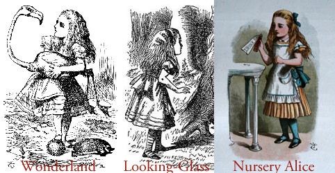
Tenniel added Alice’s now iconic headband and striped stockings for Carroll’s sequel, Through the Looking-Glass and What Alice Found There.
David did not include a headband for his Alice. But he had been painting striped stockings for years in many contexts, so it was natural for him to give her a pair.
In Tenniel’s illustrations, Alice wears shoes with ankle straps. David gave her boots (loosely based upon a vintage pair in my collection.)
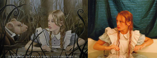
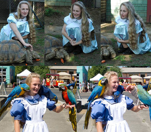
We began the project with an inexpensive store-bought dress (see the photos with our tortoise) but later worked with seamstress, Sara Bergman to create a better-quality one (see lower photos with birds). As you can see in the photo, the birds (pets of book-patron Doug Oberst) were fascinated by the costume’s buttons and sleeves as well as Cameron’s remarkable hair.
Some of the first paintings show the early dress (see pages 2 and 24). If you look closely, you’ll see that the fabric is softer and shinier. Also, the stripes are missing from her sleeves. In fact, there are many inconsistencies with Alice’s costume (usually missing stripes). If you are reading the book aloud to children, it might be fun to ask them to look for mistakes.
Full confession: our actual Alice costume had no pockets, though one is mentioned in the “presenting the thimble” scene. (We must choose to imagine one hidden beneath Alice’s pinafore.)
Interior Text Font:
Font Size:
“Leading,” refers to the distance between baselines of type. It takes its name from the fact that when type was still set by hand, thin strips of lead were placed between the lines. When examining the errors in the 1897 edition of Alice, I sometimes found myself thinking about all the lead that typesetters were exposed to and wondered what sorts of problems it might have caused.
My page layout experience was with Quark Express but I decided to use Adobe InDesign for Alice. Being entirely new to the program, I solicited assistance from typesetter Bill Brunson, who patiently helped me set up all the fundamental page elements and coached me on the use of the software—showing me how to physically execute my ideas. He noted my attention to fine detail and (rightly) pointed out that no normal publisher could afford to pay a typesetter for that kind of work. (Of course, we couldn’t either, but I was willing to put in the time because this was a labor of love.)
After I had placed the type as well as my skills allowed, I asked Thomas Phinney, a local type expert (who, coincidentally, had worked with our font’s designer, Robert Slimbach) to help me with the fine-tuning. Thomas volunteered many hours, working with me over Skype in the evenings. It was an honor to work with and learn from such an expert and I was charmed by the fact that Thomas insisted on taking breaks in order to read bedtime stories to his daughters. (I was impressed that he was on his second round of reading the Lord of the Rings trilogy.) As they say, “the devil is in the details,” and I’m grateful to both Bill and Thomas for indulging my perfectionism, then raising the bar even higher.
Placement of Images:
I’ve read many picture books aloud to children and know what happens. Typically, the child waits impatiently through pages of text hoping to see a picture. Meanwhile, very often the associated image is on a different page, so the child wants to flip forward or backward to see what is happening.
“What if,” I wondered, “we could place at least one image on every single page spread of the story (to prevent boredom) and also make sure that at least one image relates to the actual text on that spread?”
It turns out that with a book of this length, that’s a huge challenge (which is probably why it’s never done). But once I had the idea, I couldn’t let go of it. So, though it meant putting us behind schedule, I proposed the idea to David. We then sat down and worked our way through the entire book, planning the additional images we’d need to meet my goal. By the time we were done we had added 30% more art than we had at the time of our Kickstarter campaign. Fortunately, our backers were patient and David was very pleased with the additions.
Though I can’t be certain, I am told by two experts that this volume of Alice’s Adventures in Wonderland has more color illustrations (96) than any other in the book’s 151-year history. The next most heavily illustrated edition would be Harry Rountree’s 1908 book which had 92 color images. Apparently, without intending it, we managed to break a record that had been held for more than 100 years.
Text Breaks:
Hanging Punctuation:
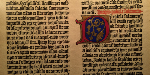
While considering this choice, I found myself wondering about the history of hanging punctuation. Was it too modern? As I worked, I glanced up at this facsimile page of Gutenberg’s 42-line Bible (1450-1455) and there it was—hanging punctuation. Not new at all.
Page Layout:
The specific margins of this book are not arbitrary. I began with the proportions of David’s vertical paintings and built the book around them, using a method known as the van De Graaf canon, sometimes called “the secret canon.” I found this pleasing to the eye and loved its connection to the history of book arts. But I also liked the fact that it would probably appeal to Carroll’s love of geometry. (As I worked, I often imagined Carroll’s persnickety ghost looking over my shoulder and I tried to please him whenever I could.)
Following the canon, the book is divided into nine horizontal sections and nine vertical sections. Note that the inside margins each measure one-half of the outside margin. So, when the two center margins are combined, they create a middle margin that is equal in width to the left and right margins. If you search youtube.com by “van de Graaf canon,” you will find an animation showing how such a layout is drawn. At my request, Bill Brunson set up a 9x9 grid for me in the page layout software and I often used it when making design decisions.
SOME BRIEF NOTES ABOUT THE TEXT:
Though it is very similar to Carroll’s final (1897) edition, our text involved months of research and discussion with an international team of volunteers. Our goal was not to follow any contemporary or Victorian style guide, but to honor Lewis Carroll’s final rather idiosyncratic intentions.
All of this work was rooted in the painstaking research of my co-editor, Dr. Selwyn H. Goodacre, who has been studying and comparing various early editions of the text for decades. (No one in the world is more knowledgeable.)
Eventually, I’ll write a comprehensive article about the text for this website. But until then, I’ll briefly mention just a few oddities you’re likely to notice.
You’ll see contractions with double apostrophes (ca’n’t, sha’n’t, and wo’n’t). These were intentional, and Carroll was not alone in using them.
Carroll also used a lot of hyphenation. He made many modifications over the years, and his final edits for the 1897 edition included the addition of many hyphens.
I based my “Mouse’s Tale” shape (see page 26) on the 1897 version. Thanks are due to volunteer Jan Groh who made a suggestion that helped make the tip a little more “pointy.”
Everyone approaches the typesetting of the tale/tail a bit differently, and it’s tempting to tinker with it endlessly. I still have trouble looking at it without wanting to make changes. As a side note: I’m not a Mouse’s Tale snob, but I do think that all versions should end on the fifth bend, to match Alice’s words. (Oddly, this is not always the case.)
You will see three instances of an asterisk pattern (on pages 8, 10, and 44). These all occur when Alice is either shrinking or growing. But Carroll did not always use them to signify changes in size. Note, for instance, that when Alice grows on page 30 there are none. Unlike many editors, I preserved the same number and basic geometric pattern that appeared in the 1897 text. I did this because readers are still finding hidden meanings in Carroll’s work and it seems entirely possible that a future reader will discover some significance to the number or arrangement of the asterisks and may also determine why they were used in some places and not others. (If you’re so inclined, please do tackle this puzzle!)
There are fifty-one double em-dashes in our book. It may sound silly, but I’m rather proud of these archaic marks because many editions (including Gardner’s The Annotated Alice) do not include them. Instead, editors convert them to single em-dashes as if there is no distinction. Even Dr. Goodacre, was surprised when I raised a concern about this.
I suspect, though I can’t be certain, that Carroll used double em-dashes for specific purposes. During the project, our star researcher, Katie Van Heest of Tweed Editing investigated the history of the mark and identified several possible uses. I’ll itemize these in the future article.
To see an example of a double em-dash, go to page 19. On the third and fourth lines you’ll see single em-dashes, but on the fifth line, you’ll see a double. In this case, the mark is used to suggest an abrupt interruption of speech.
Double em-dashes were unusual even in Carroll’s time, but have been favored by other authors including Jane Austen and James Joyce.
There was disagreement among our team members about double em-dashes and many other points. I take full responsibility for the choices in this book and acknowledge that my decisions are by no means “best.”
I was less knowledgeable than a number of the people involved in our proofreading discussion, most notably Dr. Goodacre and Michael Everson. Nonetheless, I occasionally chose to differ from them, not because I felt I knew better but because, when in doubt, given my ignorance, it seemed safest to cleave to the original. Goodacre and Everson each have their own well-researched texts and soon you’ll be able to read about the (minor) differences between these and others. For the record, I don’t think a truly “definitive text” is possible. Even after exhaustive research there are certain decisions that remain subjective.
In the interest of transparency and scholarship, I documented the arguments raised by our team. Soon Katie Van Heest and I will create a website that shows our team’s findings. When it’s posted, you’ll be able to see how involved this process became. We were still debating punctuation an hour before submitting proofs. (Our final decision involved whether or not to italicize a particular period.) I cannot claim, by the way, that such care was applied to this website.
A FEW RANDOM NOTES ABOUT SPECIFIC ILLUSTRATIONS:
Alice in the Kitchen:
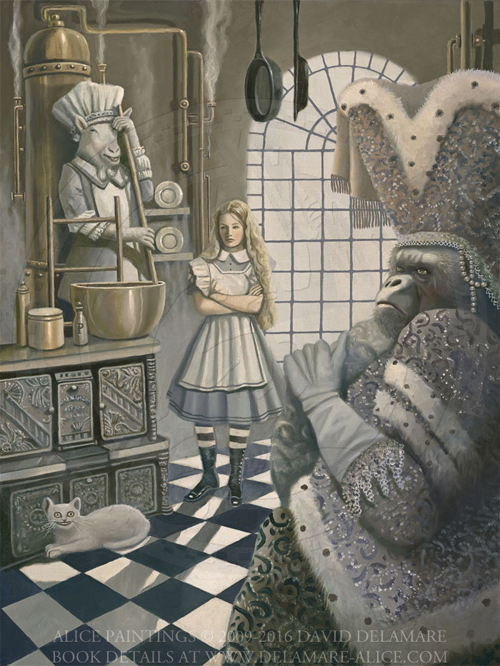
Our Alice model, Cameron was tickled by the fact that David chose to depict the cook, who famously uses too much pepper, as a goat on page 50. “That’s perfect,” she said, “because goats will eat anything.”
In the courtroom scene, the cook carries a “pepper-box.“ I was curious what this term would have meant to the Victorians. As it turns out, the very un-box-like object that appears on page 116 is a pepper-box.
There were multiple meanings for this term, and my guess is that Carroll might have had them in mind. I’ll soon be writing an article on the subject. When it’s published, I’ll post a link. The pepper-box was the last pencil drawing created for the book and did not appear in the first (destroyed) printing.
The Mad Hatter’s Song:
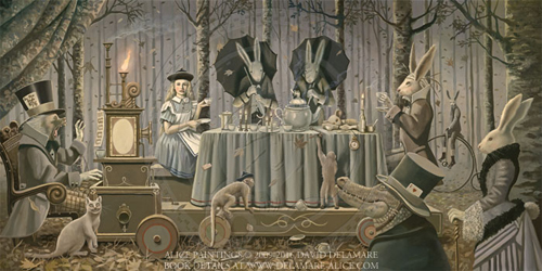
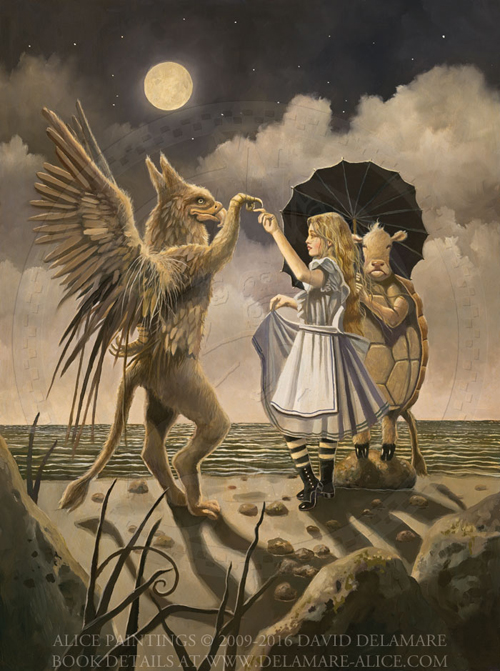
One of the tricks that David often employed was having one or more characters look directly at us as if they were suddenly aware of our presence. This can feel as if a door has opened between their world and ours. In this scene (on page 66) Alice seems to see us. But I am particularly charmed by the rabbit on the penny-farthing bicycle.
The rabbit also demonstrates David’s use of compositional layers. Having him in the distant background and the crocodile in front gives the painting a feeling of three-dimensionality.
The crocodile is a reference to the poem on page 14. David also chose to depict the executioner as a crocodile (on page 85).
Note that David worked Carroll’s significant number 42 into this piece, though the four and the two do not appear together. I favored the number as well. Note that there are 142 printed pages in this book.
The Queen of Hearts:
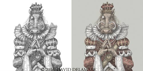
The Queen of Hearts, who appears on pages 76, 78, 118, and 124, is depicted by David as a warthog. When David first began drawing her, I walked into the room and asked, “do female warthogs have tusks?” David didn’t know and didn’t care. He wasn’t that literal in his thinking. But I was curious and researched the matter. As it turns out, female warthogs do have tusks, and the tusks of the females (and only the females) sometimes grow into a heart shape. This was a lovely bit of creative kismet.
The Lobster Quadrille:
The original painting of “The Lobster Quadrille” on page 97 is now situated in Singapore, in the dining room of Colleen Francisca, a former Miss Singapore. I love it that the paintings have reached such far-flung locations. (In fact, as a result of Kickstarter, there are several Alice paintings now in Singapore.)
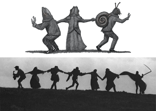
This little procession drawing from page 98 will ultimately find its home in Mexico. It’s an affectionate nod to filmmaker Ingmar Bergman. The pose of the characters is similar to the poses of the procession in his film “The Seventh Seal.” Film buffs will recall that the Seventh Seal features a chess game and, as mentioned above, chess figures significantly in Carroll’s work.
Thanks to generous gifts from Ken and Annie Edwards, several of the paintings from the book are now in the permanent collection of the National Center for Children’s Illustrated Literature. These include “The Rose Garden” on page 76, “The Owl and the Panther” on page 104 and the two paintings in the acknowledgments section (pages 132 and 133).
The text on the bottle on page 132 uses nonsense words from the poem “Jabberwocky” which appears in Carroll’s sequel Through the Looking Glass and What Alice found there The poem is shown below:
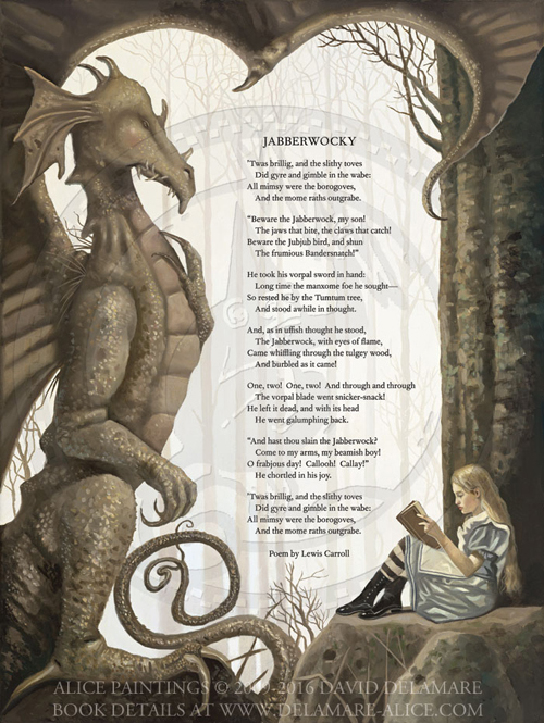
Though David illustrated several images from Through the Looking Glass including Jabberwocky, Humpty Dumpty and Queen Alice, he never intended to illustrate the book.
Alice With The Pig:
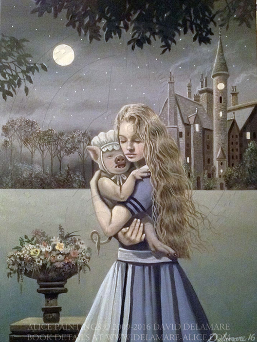
The very last painting that David created for the book was this image of Alice with the pig. He had painted a different image, which appeared in the first (destroyed) printing but, at the last minute, decided to replace it with this one.
After David died, I agreed to sell the original piece to a lovely family I had met through Kickstarter. But I wept to do it because I think this just might be the most tender painting that David ever created.
David rarely displayed vulnerable emotions except when viewing art. In twenty-two years I think I only saw his eyes fill with tears once in response to something personal—when we exchanged wedding vows.
But he was remarkably tender with animals and everyone who knew him well was struck by his devotion to his rabbits. He took all his naps on the floor so that he could be near them, worried about them when he was away for more than a few hours, and never left the house without physical snapshots of them in his pocket which he would show, like a proud parent, to strangers. When I look at the way Alice holds the pig in this piece, I am reminded of that tenderness and it fills my heart with longing.
There is a beautiful passage in Peter Pan that describes Mrs. Darling:
She was a lovely lady, with a romantic mind and such a sweet mocking mouth. Her romantic mind was like the tiny boxes, one within the other, that come from the puzzling East, however many you discover there is always one more; and her sweet mocking mouth had one kiss on it that Wendy could never get, though there it was, perfectly conspicuous in the right-hand corner.
The way Mr. Darling won her was this: the many gentlemen who had been boys when she was a girl discovered simultaneously that they loved her, and they all ran to her house to propose to her except Mr. Darling, who took a cab and nipped in first, and so he got her. He got all of her, except the innermost box and the kiss. He never knew about the box, and in time he gave up trying for the kiss.
David and I were very close. But I recognize now that, except for on our wedding day, when he was clearly in a kind of emotional altered state (his expressions in the photos are often unfamiliar) there was a hidden tender part of him that I could never quite reach. It was reserved for his bunnies and his art.
Like several other elements in this book, the picture of Alice and the pig doesn’t quite make sense in the context of the story, and yet it reveals something about David. I like to think of this particular painting as a kind of unconscious self-portrait.
Everyone, I suppose, has a small, hidden door that leads to the very center of their hearts. For David, that door was most open to animals; so it’s wonderful that his last complete project was filled with them. And he spent his final moments with those that he loved most freely.

ACKNOWLEDGMENTS:
Through all the world there goes one long cry from the heart of the artist: Give me leave to do my utmost.—Isak Dinesen, Babette’s Feast
The most extraordinary aspect of this edition of Alice has nothing to with the details described above. It is the fact that this book was the collective accomplishment of more than 800 individuals who gave funds, time, skills, labor, patience, and love to make it happen.
That community gave us what all artists seek, but few find—the time, materials, and encouragement to fulfill a personal vision with absolutely no compromise. We owe a deep debt of gratitude to every single person who helped.
The book contains only a partial list of the remarkable volunteers and patrons who made this project possible. Very soon we will post a more comprehensive list on this website.
There is still much to say about this book, especially about the text. Keep an eye on this site as it evolves. And please consider joining us for the creation of our future projects. If you’d like to be kept informed, visit our links page and follow us on Facebook or subscribe to the newsletter at daviddelamare.com. Thank you!